Samsung's latest software update, One UI 7, introduces a bold redesign to the way users interact with notifications and Quick Settings, a move that’s bound to stir opinions. In the ever-evolving landscape of Android interfaces, Samsung has decided to revisit an older method by separating the notification tray from the Quick Settings panel, a decision that echoes the Android designs of yesteryears, specifically pre-Android Marshmallow.
Revisiting the Past with a Modern Twist
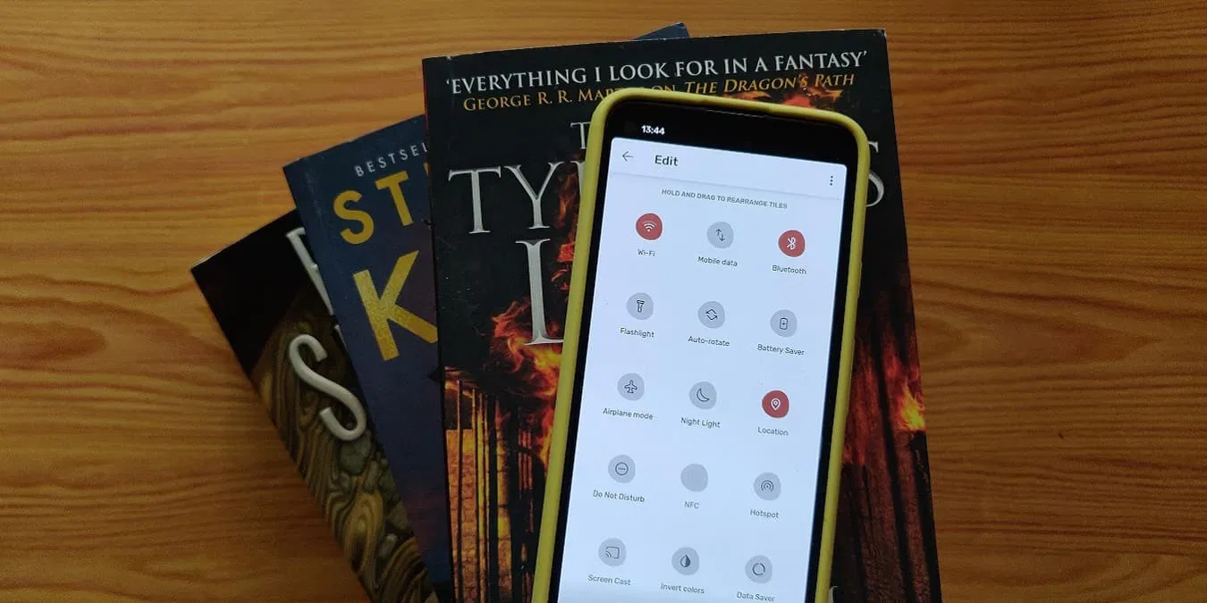
Historically, Android users experienced a split between notifications and Quick Settings, a design that allowed for differentiated access with distinct gestures: a single swipe for notifications and a double swipe or two-finger swipe for Quick Settings. This changed with Android Marshmallow, which simplified the process, combining both into a single interface that could be revealed with consecutive swipes. Samsung’s One UI 7, however, diverges from this path to reintroduce the split interface, enhancing the user experience by tailoring access according to the frequency of use and importance. This change, while seemingly minor, represents a significant shift in user interaction, prioritizing a more intuitive layout that allows notifications to occupy the majority of the interaction space—about 75%—with Quick Settings filling just the remaining quarter.
Seamless Integration with Intuitive Gestures
What sets Samsung’s implementation apart is the preservation of traditional notification interactions. Users can still swipe to dismiss notifications effortlessly, and accessing Quick Settings requires just a swipe from the right side of the screen. This intuitive gesture design means that despite the separation, the experience feels cohesive and logical. The adjustment is surprisingly quick and has been noted to be preferable to the more balanced splits seen in interfaces from other manufacturers like Oppo and OnePlus. Critically, Samsung has also included an option to revert to the unified tray, allowing users to choose between the separated and combined views through simple settings adjustments. This flexibility ensures that all users can tailor their experience to match their preferences, making it a user-centric update.Community Reactions and User Adaptability
Initial reactions to One UI 7's split design may vary, as changes that affect muscle memory often do. However, the thoughtful implementation suggests that many users will grow to appreciate the separate panels for their ease of use and efficient access. Samsung’s commitment to providing options and maintaining familiar gestures should help ease the transition for long-time Android users.